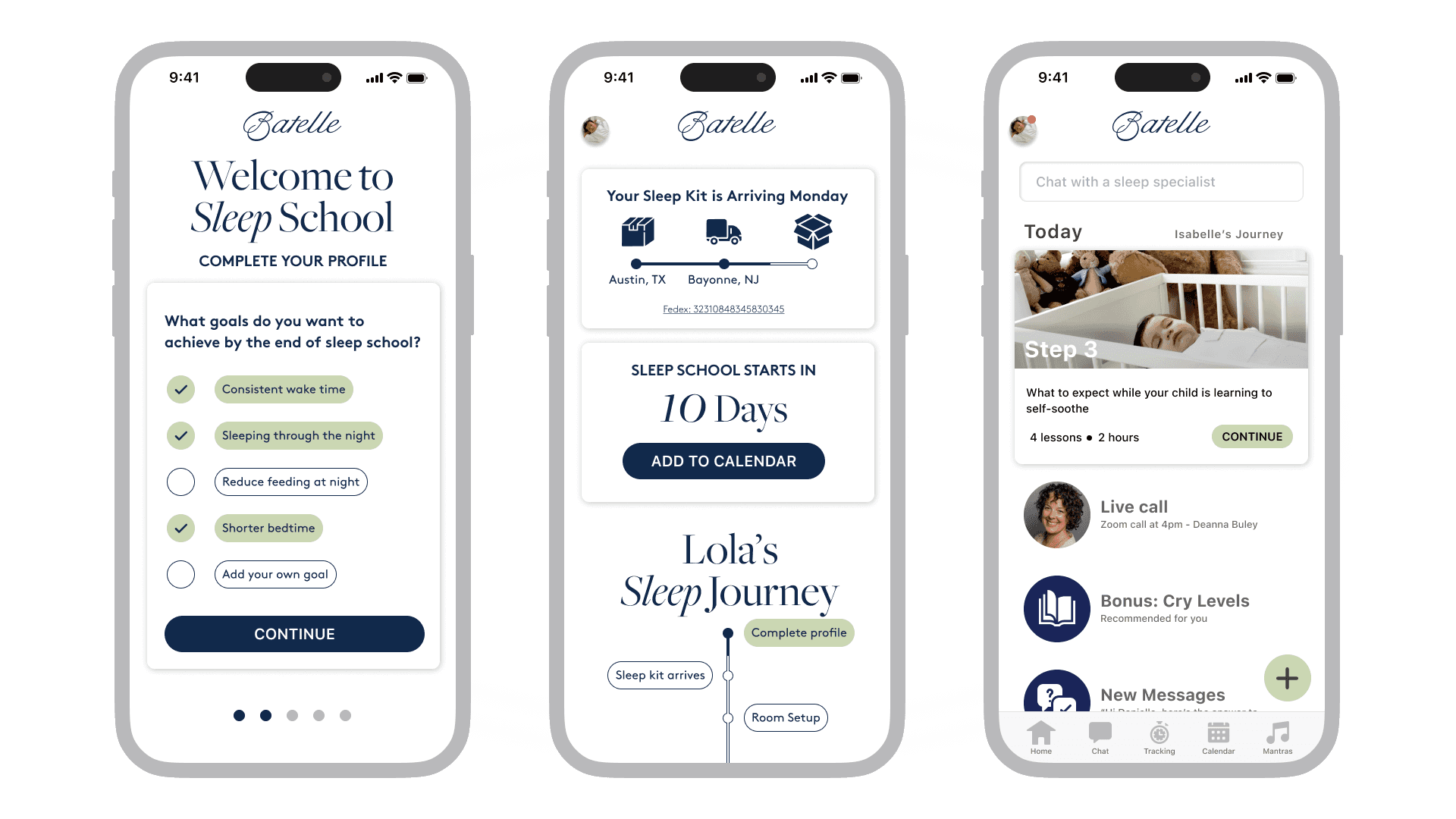
Batelle brings relief to sleep-deprived parents with an expert-led sleep training program. Their clients love them, and say the method is life-changing - but there was a growing number of early refunds by parents who hadn't even made it through the onboarding process. Onboarding systems that had worked for a smaller number of clients were beginning to break as the business grew, breaking new clients' trust in the process. The challenge of this project was to develop an integrated UX and OPS plan that would communicate value early, and establish clients' trust.
Working in direct collaboration with Batelle's founders, CTO, and sleep experts, I delivered a complete plan for an overhaul of the onboarding process, including a client-facing app and internal automations for the OPS team. This new simplified, scalable onboarding process provided a seamless, personalized experience to clients, relieved pressure on the team, and solved Batelle’s problems with client retention.
Batelle's clients were busy, stressed, sleep-deprived parents, and the existing onboarding process added to that stress. There were critical problems with information overwhelm and fragmented communication - enough to make parents quit the program before it even started. To address these problems, we needed to make every interaction high-value, clear, and consistent.
For consistency, we needed to establish a linear pipeline with discrete phases. This led to designing a visual map of this pipeline to give clients a sense of progression through onboarding, and anticipation for Sleep School.
There was also a lot of redundancy we were able to cut. The essentials that remained could be broken into smaller manageable steps that were delivered one at a time as they were completed.
A major part of this strategy was pairing instructions with incentives. Clearly communicating the value of each step showed respect for clients' time, and made tasks feel important rather than tedious. This eliminated the need for constant follow-ups and reminders.
Batelle's clients don't want to fill out forms or do "purple playtime" exercises - they want to get some sleep. By communicating the purpose of each step, and how it fits into the overall journey, clients saw how each of these tasks moved them closer to their ultimate goal. As a result, they were more likely to complete each step, and more engaged with the material.
Each step makes sense as part of a cohesive plan. Even while clients are waiting, they know they're still on track. The visual Journey Map locks them on the current step until completed, and lets them look ahead while their Sleep Kit is still in transit or they're awaiting approval of their room setup. Questions about start date and shipping info are answered at a glance.
We only kept the most high-value essentials, and presented them in small, manageable steps. Progress dots under the sign-up cards let them know the end is in sight. Clients only see what they need to know right now. They can look ahead to future steps, but aren't bombarded with information they can't use yet.


