I wanted to design a jewelry collection inspired by architecture and medieval armor that gave the wearer a feeling of protection. The challenge of this project was translating my vision into something that was comfortable and wearable, keeping the operation lean and startup costs low, and zeroing in on a customer base.
As a one-person team, I developed Valkyrie from concept to product launch. In addition to designing and 3D modeling the pieces, I oversaw manufacturing, designed and built an e-commerce website, conducted market research, and executed a strategic marketing plan through press editorials and social media.
Early feedback pointed toward simplification. Potential customers thought the more detailed designs were too busy. Plus, rings are small, and much of the detail would be difficult to see or wouldn't cast properly in production. In keeping with the strong silhouette, I developed a star motif that could be adapted to different designs and make the collection feel cohesive. I made sure the modular components of the motif were large enough that one key detail - the sweeping concave planes - was clearly visible.
The process of 3D modeling revealed design problems I hadn't considered before - for example, how would the star motifs join together? How dramatic should the curves' slope be, and how much should it protrude from the center? The 3D design process also inspired new designs, which I saved for future collections.
There was also a learning curve to get the dimensions and thicknesses right. The first iterations were extremely bulky and uncomfortable to wear - you couldn't even bend your fingers! Then I overcorrected and made impossibly delicate versions. The most important thing I needed to figure out, that required the most trial and error: how pointy is too pointy? It was surprisingly difficult to tell when designing!
Over time I was able to develop parameters for thicknesses, etc. to make it easier to get future designs closer to the right dimensions. I also made the star motifs into reusable components to cut down on the time to design new pieces for the collection.
For the MVP, I launched four variations of the original star motif. It was important to keep this first iteration as lean as possible, and launch before it felt completely "ready." This way, I got early feedback from real customers.
I prioritized simplicity, for a couple of reasons. First, keeping the website simple meant I could launch sooner. Second, I wanted the brand's visual identity to come through the photos more than the graphic elements of the website. This makes it easier to adapt the visual style as I refine the brand's "voice," just by switching out photos.
The website is responsive to different device types, especially focused on the mobile experience. Most customers would be arriving at the website through social media links, and would see the mobile website first.
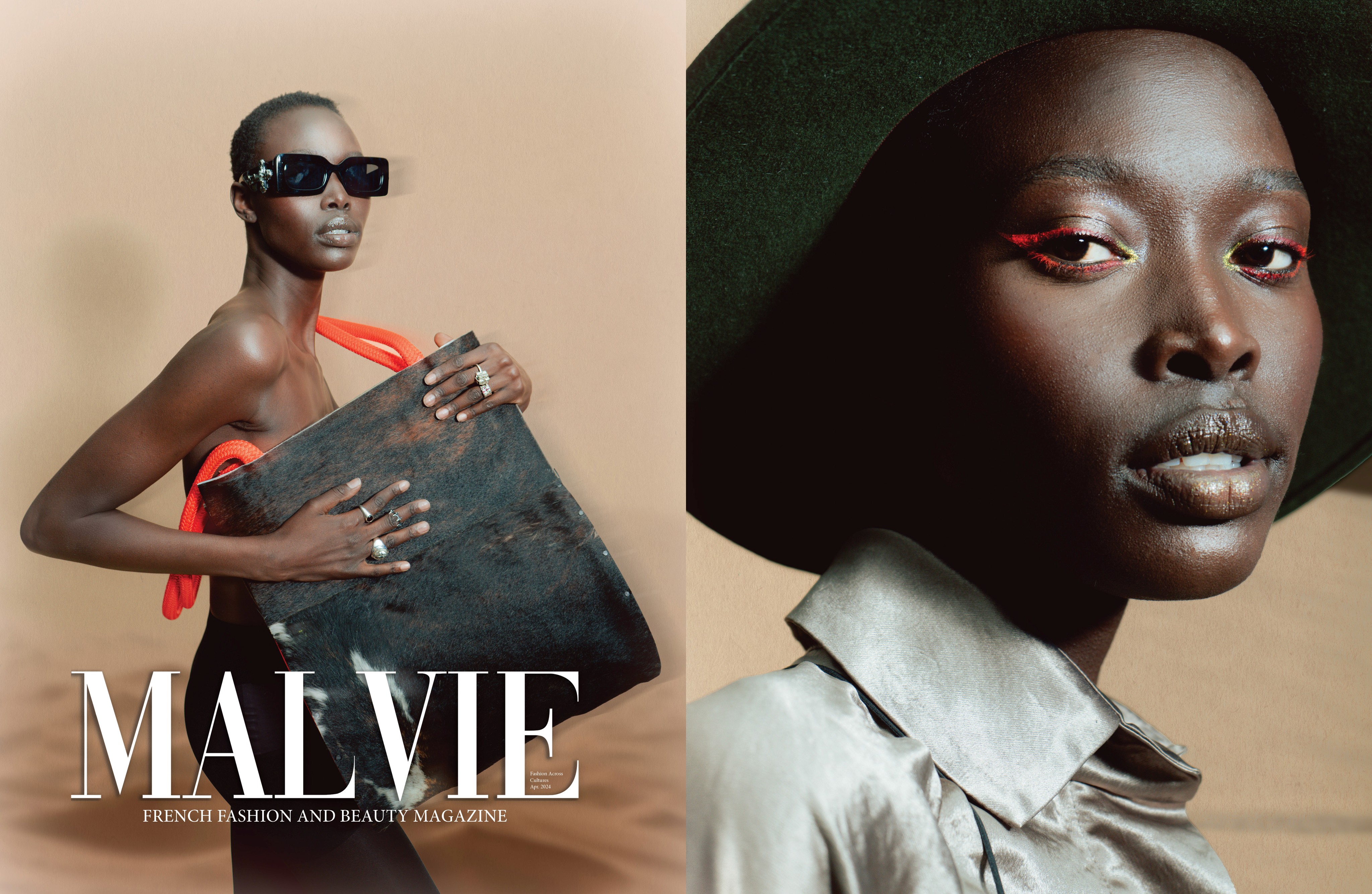
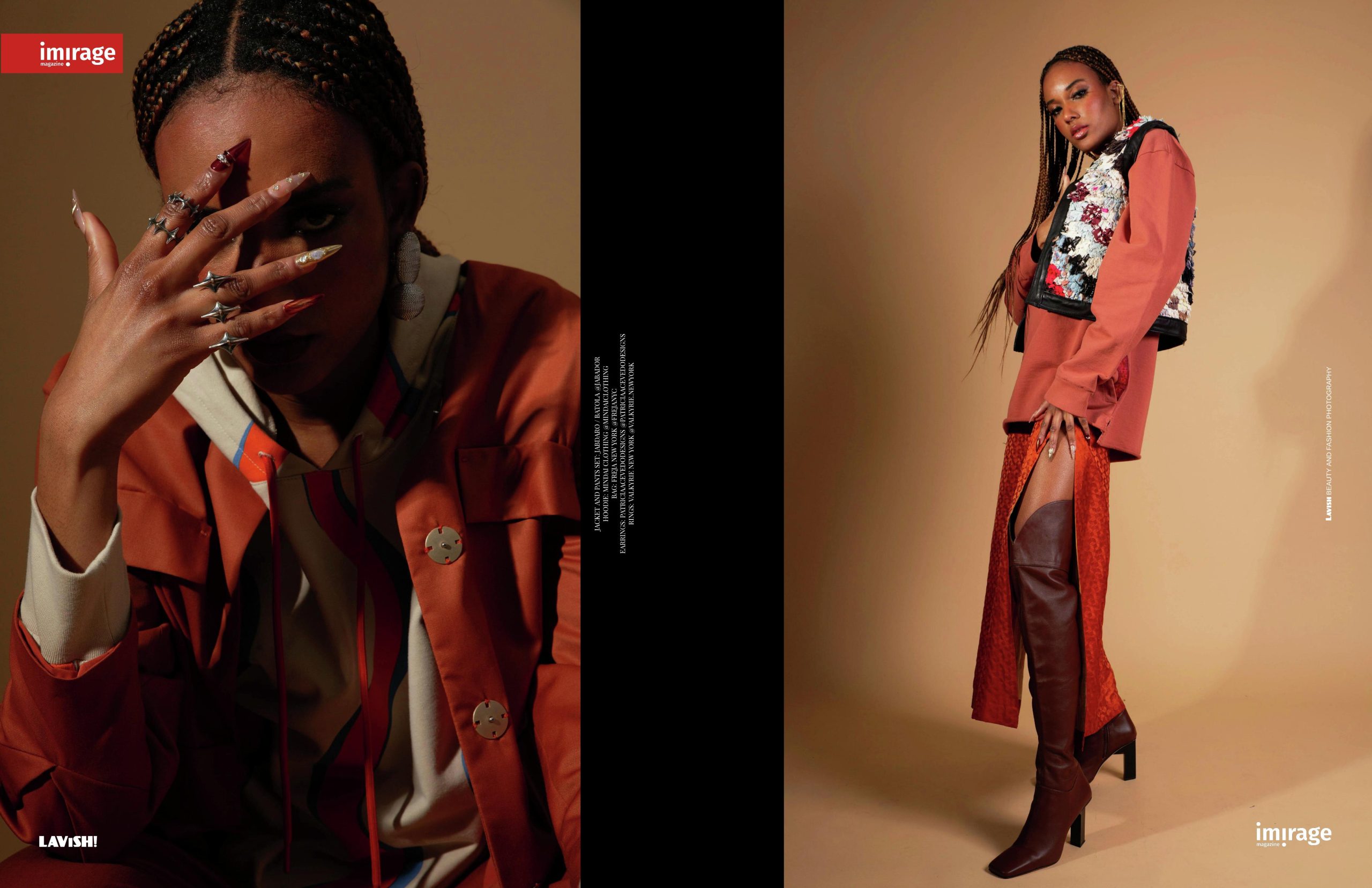
Valkyrie needed three essential things: eyes on the product, a compelling visual story, and a sense of credibility as a new brand. I worked with stylists and content creators to place products, worked with a retailer in NYC to display pieces, and ran A/B tests for instagram ads. This led to editorial features in Harper's Bazaar and Glamour Magazine, and a 400% growth in Valkyrie's customer base over the course 3 months.
There's still a lot to learn! In the coming months, my priority is zeroing in on my target audience. So I need research - I'll continue to A/B test ads, interview customers, and study competitors to refine Valkyrie's "voice," visual style, and positioning. I'll also be testing new jewelry designs to see what customers respond to.


